Environs
David Barnes' colorful Columbia Heights apartment
| |
SIMPLY DAZZLING — This Columbia Heights junior 1 BR packs a lot into a small space. Bold colors, whimsical touches and easy comfort make this a creative and always evolving space. French doors give the apartment a certain je ne sais quois that sets the stage for regular entertaining. |
|
Rental agent doorman by day, interior decorator and commercial and cartoon artist by night, David Barnes exercises his creativity in his charming Columbia Heights junior one bedroom.
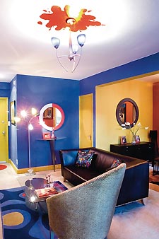
DAVID: [In the living room] I’m a big fan of jewel tones. I like bright, primary colors. They’re not for everybody but I like them. I am a fan of animal prints and earth tones as well, so it’s hard to mesh them all together and make it work. I think I did okay. You can see the dining room is more subdued but I still wanted the bright colors as well. I guess you could say my style is ”modern ethnic.”
I’m a big I Dream of Genie fan. I have a small collection of genie bottles. Ever since I was 7, I wanted one — it took me 30 years but I finally got one. I found a guy online who makes them, so I ordered three. This is the first one I bought. That’s a little genie sticking her head out of the bottle — it’s a Christmas ornament that someone gave me. She just fit perfectly in it. And I found this photo of Barbara Eden and her stand-in online and just printed it and stuck it in a frame. As you know, she played both parts, Genie and her sister, but that’s actually her stand-in in that photo.
|
I don’t like anything too serious. Anything that’s kind of whimsical, I’m all for it. I love curves and things like that. The rug is an Ikea piece but I painted it in certain spots where it was white — I wanted the colors to match so I just put fabric paint on it. The leather pillows on the sofa are also hand-painted to match. I changed all but one lighting fixture in the apartment. When I added the chandelier, I couldn’t paint the ceiling so I decided to just put a little red splotch up there because it just looked like it was floating, so I wanted something to ground it.
 |
 |
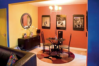
[In the dining room] The dining table was bought about 10 years ago and I’m looking to update that. But I like it as it is. I reupholstered the seats, bought a new rug for here. This is the newest piece, the sideboard and the mirror. The artwork is posters that I bought from Lambda Rising — I cut off all the lettering and just took the pictures out, dry mounted them and then took the frame and spray painted it and put the silver washes on the corners.
 |
 |
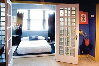
[In the bedroom] When I looked at the building, this was the only apartment that had French doors on the bedroom, so that’s one fact that made me choose this unit. The color scheme is black, white and bluish-gray. I’m a big fan of black-and-white photos. About a year ago, this room was red with a very African theme. After seven years I changed it. The bed is another Ikea piece — a black-and-white platform bed. The closet doors I painted in black but I used a flat and a semi-gloss to achieve this effect of the checkerboard. This was supposed to be a closet but I took the door off and use it as a display shelf. I couldn’t afford to get lighting wired in there so I thought these tap lights were a great idea.
The pillows on the bed I printed on T-shirt paper and ironed [onto the fabric] and then sewed a pillowcase. The light is from Ikea. They call it their Medusa light, I believe. It looks really good at night. This old, wood cabinet I also found — someone had thrown it away. I did the same technique on it as I did on the closet doors. It was an icky, oak brown color before. Most of the furniture is from Ikea. The bed dressing itself came from Linens and Things, a mixture of the Linens and Things brand with some Isaac Mizrahi sheets.
 |
[In the kitchen] The kitchen is small but it works for me living here all alone. They renovated this place in ’98 when I moved in. It was an old Howard University dorm so all this is the new stuff that was put in. White refrigerator, white cabinets, kind of a gray-lavender counter top. I painted the walls a butter yellow, like a light terra cotta — it reminded me of sweet potatoes and butter. It’s kind of Miami-inspired. I entertain on the weekends. Not during the week. I always have at least two or three friends over on the weekend to watch movies and stuff like that. It’s a comfortable space for it.
For more Environs profiles, visit www.metroweekly.com.
More from Metro Weekly:


Support Metro Weekly’s Journalism
These are challenging times for news organizations. And yet it’s crucial we stay active and provide vital resources and information to both our local readers and the world. So won’t you please take a moment and consider supporting Metro Weekly with a membership? For as little as $5 a month, you can help ensure Metro Weekly magazine and MetroWeekly.com remain free, viable resources as we provide the best, most diverse, culturally-resonant LGBTQ coverage in both the D.C. region and around the world. Memberships come with exclusive perks and discounts, your own personal digital delivery of each week’s magazine (and an archive), access to our Member's Lounge when it launches this fall, and exclusive members-only items like Metro Weekly Membership Mugs and Tote Bags! Check out all our membership levels here and please join us today!


