Celebrating Metro Weekly's birthday with 16 of our favorite covers
Text by Sean Bugg Photography by Todd Franson Models: Roger Reavis and Edwin Brownell
May 6, 2010
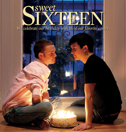
Sweet 16. The age of driver’s licenses and birthday bashes, an iconic moment in the life of an American teenager when you’re treated as an adult but still get to act a bit like a kid.
In some ways, the perfect age.
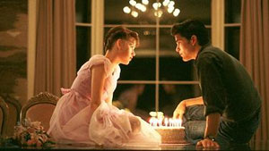
Then again, that may be our devotion to Sixteen Candles seeping through.
So we’re celebrating our own Sweet 16 not with candles but with covers – starting with our little homage to our fave John Hughes movie.
Over the years, Metro Weekly has changed sizes and approaches, but we’ve always considered our cover to be our weekly ”Hello!” It’s a collaboration by photographers, art directors, editors and writers – our entire staff – to create something special that grabs your attention and celebrates our community.
This iconic image from John Hughes’ classic film ”Sixteen Candles” was the inspiration for our cover.
Now, we’ll be honest: In 16 years, we’ve created more than 800 covers, so we won’t even pretend that we could choose 16 favorites. Instead, these are 16 of our favorites. As part of our ongoing birthday celebration – hey, you only turn 16 once! – we’ll be including more of our favorites online at MetroWeekly.com throughout the year.
But for now, sit back and imagine you’re Molly Ringwald – or, if you prefer, Jake – and enjoy the best birthday you’ve ever had.
We know we are.
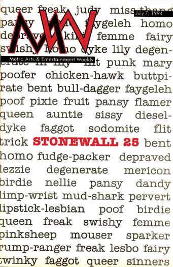
Stonewall 25
July 7, 1994
In its first weeks, MW was searching for a formula that would capture the magazine’s attitude in a way that also captured the reader’s eye. The cover for our story on the New York celebration of the anniversary of the Stonewall riots and the birth of the modern gay-rights movement was certainly grabby. And it also visibly reminded us that as far as the community had come, we still had a long way to go.
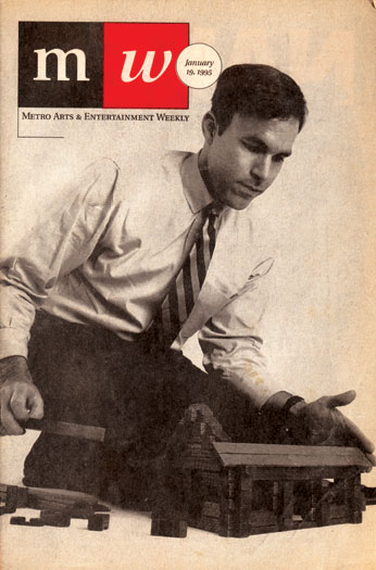
Rich Tafel
January 19, 1995
MW quickly established a distinctive style with striking images that spoke for themselves, unadorned by text. That meant getting people to sit for more than a portrait. In this case, Rich Tafel — then-executive director of Log Cabin Republicans — toyed with contradictions, sporting classic Washington business attire while focusing on a playful construction of Lincoln Logs.
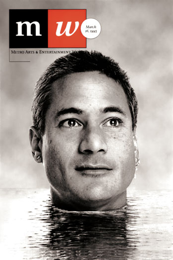
Greg Louganis
March 16, 1995
While MW‘s creative staff often preferred a more traditional, in-camera approach for its portraiture, we were also ardent early adopters of the digital revolution. Olympic diver Greg Louganis appears to be looking out over a shimmering pool of water. In reality, the portrait was taken in a downtown hotel room by Annie Adjchavanich. Louganis held a large, flat piece of corrugated plastic against his neck. Later, in his studio, art director Daryl Wakeley completed the illusion with a bit of digital wizardry, “wrapping” the plastic around Louganis’s neck and adding a sky. The result was mesmerizing — and eerily realistic.
Serving Up Halloween
October 28, 1999
In the magazine’s first major format change, designed by Nancy Saiz and later refined by Mike Hefner, MW went taller and wider – while still retaining a shape distinct from any other publication in the city. It also meant adding text to the cover — albeit at the bottom, allowing images to remain the primary draw. Here, Vita Opulence serves up her own head for a Halloween treat, a trick photographer Todd Franson created through sleight-of-computer. No actual drag queens were decapitated in the creation of the cover. ‘
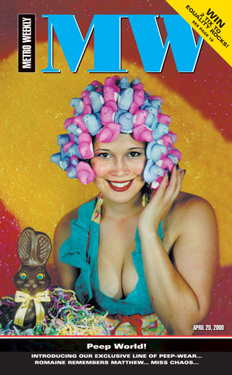
Fashion Peeps
April 20, 2000
Sure, anyone can put together a spring fashion issue. But MW put together a fashion spread focusing entirely on clothing made from Peeps. After raiding every grocery store, CVS and Target in a five-mile radius for the sugary treats, staffers Michael Wichita, Will Doig and Kendra Kuliga spent a full week crafting pants, shirts and accessories – including wigs and a codpiece – out of brightly colored marshmallow bunnies and chicks. The result: a cover that proves you can be simultaneously silly and gorgeous.
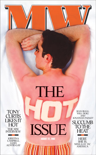
”It’s August. It’s hot. What more can we say?” That sums up August in Washington: the time when those who are able leave town for an extended vacation do, and those who stay behind are dazed by the heat and humidity. Naturally, our take on a ”hot” issue focused on literal heat, a concept nicely captured by staff photographer Michael Wichita and art director Tony Frye. No Photoshop here — that hot sunburn is a spray-on.
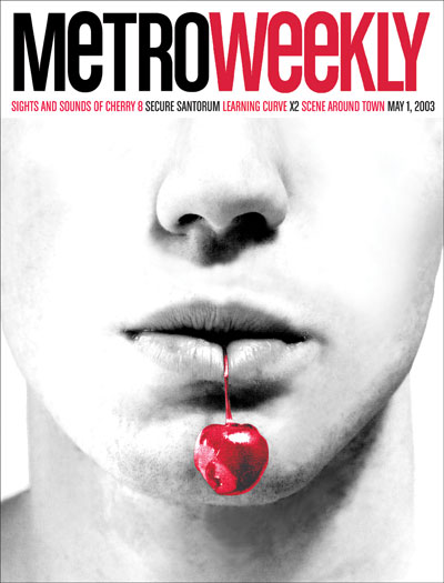
In its second major format change, envisioned by art director Tony Frye, MW reclaimed its full proper name, Metro Weekly — the better to fill the new, larger covers. With all that additional space, it was time for us to explore new approaches that weren’t feasible in the old, narrow format. Then again, sometimes simplicity is the best approach. Michael Wichita’s cover for Cherry 8 was originally conceived as eight cherries dangling from one mouth. After much review and discussion, we realized less was more: a single cherry more than sufficed.
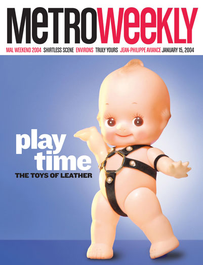
With its sometimes severe-looking accoutrements of leather jackets, slave collars and tight harnesses, it can be a challenge to convey that the LGBT leather community is a lot of fun – of all kinds. Todd Franson had actually created and photographed the kinky Kewpie with that thought in mind – but eight years before it finally ran on the cover (sometimes a good idea has to wait until the perfect time). And the Kewpie’s so cute you just want pinch it over and over. Go ahead. He really wants you to.
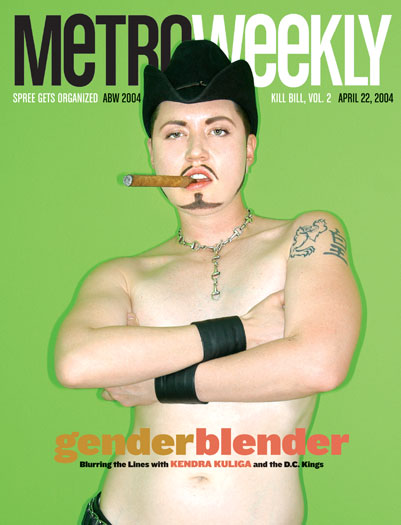
It’s no secret that a sexy magazine cover, done well, can move issues. We’ve had our share of them over the years – particularly with special issues like Nightlife Coverboy of the Year – but some bring an extra-special twist. Kendra Kuliga, renowned as Drag King Ken of the DC Kings, took to the cover for a hot gender-bending mash-up that had something for everyone – gay, lesbian, straight, male or female — a provocative image that stoked not only desire, but discussion of what gender means for each of us.
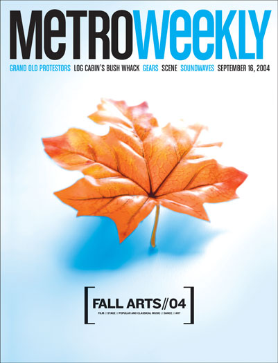
Each year, we create several special issues at Metro Weekly, but none stretch all the way to back to our humble beginnings like the annual Fall Arts Preview. Of course, that means that the challenge has been to come up with 16 unique and visually dynamic ways to say ”fall arts.” But of all the ways we’ve created – impressionistic trees, food masquerading as a palette, a curio cabinet, a phrenologist’s head – the one best remembered is this simple, yet elegant, leaf.
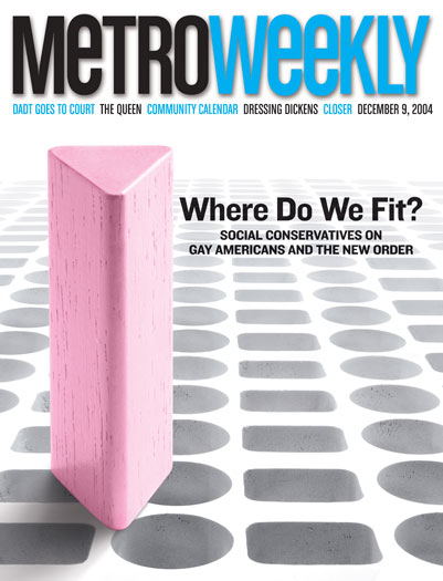
In fall 2004, after 11 states passed constitutional amendments banning same-sex marriage, many of us were understandably dazed by facing the truth that so many in the country were ready and willing to treat us as ”other.” How better to convey the feeling of being cut off from the broader national community than a play on ”square peg/round hole”? The solitary pink triangle peg also managed to capture the feelings of isolation many felt. The good news: Six years later, we have marriage equality in five states – and our own hometown of D.C. Equality comes slowly but surely.
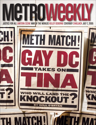
When it comes to drugs in the LGBT community, crystal meth is considered a scourge that wrecks lives and contributes to the spread of HIV. So when it came to covering a new effort by local activists to combat the disastrous drug, we wanted to convey the sense of a high-profile prizefight – a group of challengers taking on a formidable foe. Hence, wheat-pasted posters in the style of boxing promotions. While some replication was created digitally, the aged and curling edges of the paper were achieved the old-fashioned way: tea.
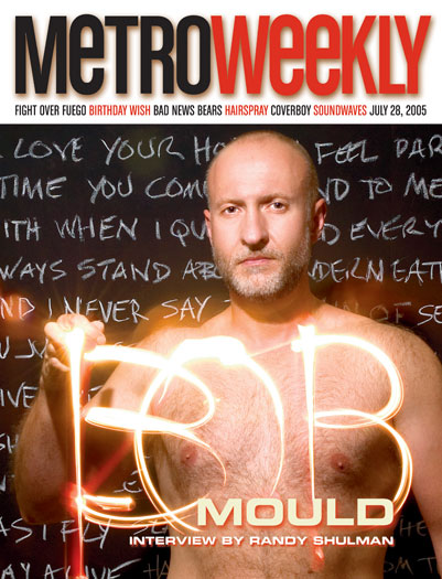
Bob Mould is one of the most frequent residents of the Metro Weekly cover. What else would you expect when a gay alternative-rock legend moves to town and keeps doing such cool and interesting things, from recording albums to helping launch Blowoff (aka Bear Heaven)? This is an image many assume was digitally created, but Todd Franson actually used a long exposure to capture Mould writing his first name in light — backward.
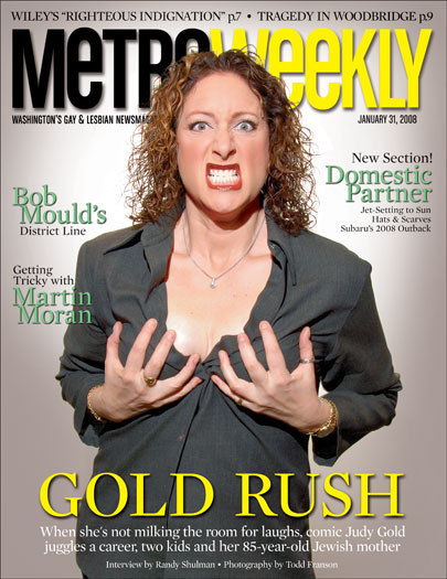
Photo shoots are an exercise in patience for all involved, from the subject to the photographer to the photo editor. Sometimes a photo shoot is simply a shoot – a chance to take a portrait that will capture someone looking their best. Other times – the times we hope for – a photo shoot yields the unexpected, whether it’s an unexpected emotion or an outburst of playfulness. That’s when everything comes together and you know, That’s a magazine cover! And so Judy Gold grabbed her breasts and gave us a spectacular moment that captured her brazen, outlandish, funny personality.
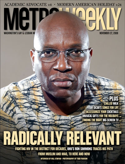
Quick: Who’s been on the cover of Metro Weekly more than anyone else in our history? Some might suspect an out-of-the-closet celebrity, a local politician or an out-and-about coverboy. They would suspect wrong. Hands down, the person most often to grace the cover is Ron Simmons, executive director of Us Helping Us. Why? First, in 16 years, he’s been interviewed three times for the cover about the ongoing crisis of HIV/AIDS in the city’s African-American gay community and his own journey as an activist. He also prominently appeared on a cover for a local AIDS fundraiser. And if you revisit many of our Year in Pictures issues, odds are Ron Simmons is somewhere in the mass of photographs.
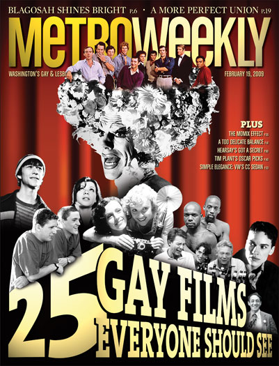
How do you capture the history of LGBT cinema on an 8-inch by 10.5-inch piece of glossy paper? Not easily. Art director Todd Franson was handed the final list of films on Monday afternoon — with a cover due to the printer Tuesday morning. He scrambled to unearth black-and-white images in our archives for several of the films mentioned and one key color image whose deployment was a creative masterstroke. We wound up with a cover that spoke the language of LGBT film fanatics, who not only snapped the issue up like it was printed on money, but spent the next year and a half revisiting the story on our website to tell us what films we’d missed. Sounds like someone wants a sequel.
These are challenging times for news organizations. And yet it’s crucial we stay active and provide vital resources and information to both our local readers and the world. So won’t you please take a moment and consider supporting Metro Weekly with a membership? For as little as $5 a month, you can help ensure Metro Weekly magazine and MetroWeekly.com remain free, viable resources as we provide the best, most diverse, culturally-resonant LGBTQ coverage in both the D.C. region and around the world. Memberships come with exclusive perks and discounts, your own personal digital delivery of each week’s magazine (and an archive), access to our Member's Lounge when it launches this fall, and exclusive members-only items like Metro Weekly Membership Mugs and Tote Bags! Check out all our membership levels here and please join us today!